Introducing a Refreshed Look for Bartlett

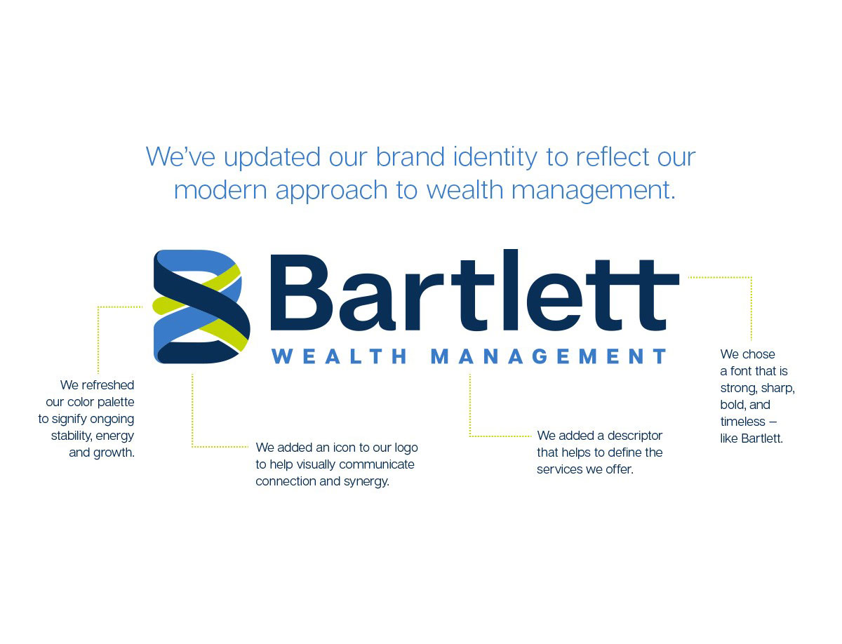
After months of planning and refining, we’re thrilled to unveil an updated visual brand identity for Bartlett. This refreshed look—including logo, fonts, and colors—more accurately portrays our modern approach to wealth management.
Among the changes you’ll see on the Bartlett website, social media channels, printed materials, and elsewhere:
- Color palette: Blues and green to signify ongoing stability, energy, and growth
- Icon: A new symbol to help visual communicate connection and synergy
- Descriptor: Adding the words “wealth management” to clearly define the services we offer
- Fonts: A new typeface that better aligns with Bartlett’s personality: strong, sharp, bold, and timeless
While we’ve evolved the look and feel of the Bartlett brand, our longtime focus remains the same: helping Cincinnati families and organizations grow their wealth. As we enter this new chapter in the Bartlett story together, we look forward to growing and evolving together.

